Tutorial: Creating a Master Curve
This tutorial will explore the fundamentals of using the mastercurves package to create a
master curve from synthetic data describing the one-dimensional diffusion of an instantaneous
point source. The tutorial is based on the example in the introduction from A Data-Driven Method
for Automated Data Superposition with Applications in Soft Matter Science,
and on this issue in the package repository.
Import Packages
Using the mastercurvse package will always require importing numpy and matplotlib.pyplot.
It also requires importing the mastercurves package itself or some modules from the package. We’ll
import the essential modules for this tutorial: mastercurves.MasterCurve and
mastercurve.transforms.Multiply.
import numpy as np
import matplotlib.pyplot as plt
from mastercurves import MasterCurve
from mastercurves.transforms import Multiply
Creating Synthetic Data
Now, let’s generate some synthetic data from the diffusion equation. We’ll ultimately work with the logarithm of this data, so let’s first define an array of positive \(x\) coordinates:
x = np.linspace(0.1,2)
We’ll also sample from a few positive values of the time:
t_states = [1, 2, 3, 4]
We also need a function to compute the concentration at different \((x,t)\) from the diffusion equation:
diffusion_eq = lambda x, t, M, D : (M/np.sqrt(4*np.pi*D*t))*np.exp(-(x**2)/(4*D*t))
Now, we can create our synthetic data. We’ll just assume that \(M = 1\) and \(D = 1\) in dimensionless units for now:
x_data = [x for t in t_states]
c_data = [diffusion_eq(x, t, 1, 1) for t in t_states]
Lastly, we’ll take the logarithm of our data. The mastercurves package can work with the raw data itself
for certain cases, but performance is much better (and the package is more flexible) when working with the
logarithm of data that will be shifted by Multiply transforms (check out the Method section of the
associated paper to learn why). So, we should almost always take the
logarithm of the data before developing the master curve.
x_data = [np.log(xi) for xi in x_data]
c_data = [np.log(ci) for ci in c_data]
Creating the Master Curve
We’re now ready to create a master curve and superpose the data. The first step is to initialize a MasterCurve
object. Because our synthetic data is noiseless, we’ll create a MasterCurve with no fixed noise:
mc = MasterCurve(fixed_noise = 0)
The next step is to add the data to the MasterCurve:
mc.add_data(x_data, c_data, t_states)
In the diffusion equation, there is both a dynamic concentration scale and a dynamic length scale. This means
that we’ll need to shift both the horizontal and vertical axes by a time-dependent multiplicative shift factor
to superpose the data. We can add these Multiply transforms (note that we could pass the argument
scale="log" to these transforms to indicate that we’re working with the logarithm of our data, but this
is not necessary since "log" is the default scale):
mc.add_htransform(Multiply())
mc.add_vtransform(Multiply())
Finally, we’ll superpose the data using these transforms:
mc.superpose()
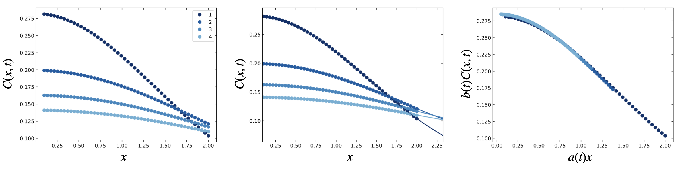
Plotting the Master Curve
We can use the built-in plot method to graphically display the data, Gaussian process fits, and
master curve:
fig1, ax1, fig2, ax2, fig3, ax3 = mc.plot(colormap = lambda i: plt.cm.Blues_r(i/1.5))
We’ve passed a colormap argument to this method to define a custom colormap to more closely match
the figures in the paper. The value of this argument can be any
colormap from matplotlib.pyplot.cm.
By default, the plot method will display the data on a logarithmic scale. Here, we’ll adjust to a
linear scale to more closely mimic the figures in the paper (using
the ax.set_xscale and ax.set_yscale methods). You can see the results below, which show the
raw data (left), data with Gaussian process fits (center), and master curve (right).
Analyzing the Shift Factors
An important feature of the mastercurves package is that we may analyze the shift factors used to
superpose the data. These shift factors are stored as attributes of the MasterCurve object. We can
grab them directly from the object:
a = mc.hparams[0]
b = mc.vparams[0]
Note that we take the zeroth (0) element of the hparams and vparams attributes. This is because
these attributes store the shift factors for each transformation added to the MasterCurve, and there
may be more than one transformation. These shift factors are stores as a list, with each element containing
the inferred shift parameters for each transform. We only have one horizontal and one vertical transform
here, so mc.hparams and mc.vparams each have only one element. For mc.hparams, that element is
the list of horizontal shift factors for each state (or the vertical shift factors for mc.vparams).
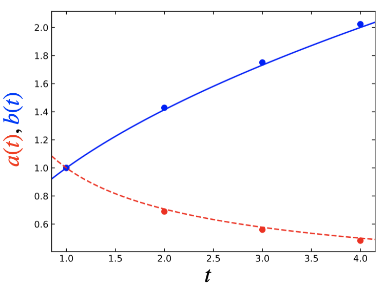
We can plot these shift factors against the state coordinate, \(t\):
fig, ax = plt.subplots(1,1)
ax.plot(t_states, a, 'ro')
ax.plot(t_states, b, 'bo')
Based on the diffusion equation, we expect that these shift factors should follow specific trends with \(t\), namely that they should vary with the inverse square root and square root of time, respectively. We’ll check this by plotting those relationships:
As we see from the plot below, the inferred shift factors indeed closely match the expected behavior!